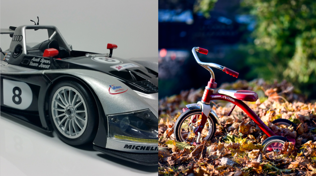
Entering Le Mans on a Tricycle – choosing the right tool for the job
As Isomorphic’s CTO, I’m typically brought in to save projects that have gone off the rails. So I’ve got 20 years experience in vigorous facepalming.
Very often, we are approached by companies that started with another technology and have hit a dead end. Typically, we end up inserting our more sophisticated components into the middle of existing screens, and then the customer migrates to our technology over time, slowly, painstakingly cutting through the spaghetti code they had to write because they didn’t start with us.
Whenever this happens, I always try to figure out how the customer ended up using some other technology rather than starting with ours.
Sometimes, they just didn’t do an evaluation at all. People blindly follow trends, and developers are just as guilty of this as anyone else.
However, sometimes, we run across a customer that did evaluate our technology, and decided against using it, only to regret that decision later.
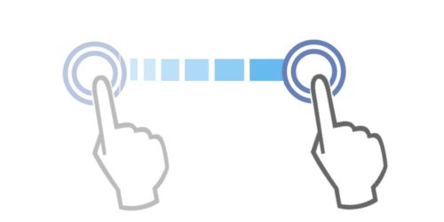
This happens because people evaluate software in the wrong way.
I’ll explain what I mean with a story.
Let’s say you are trying to figure out which vehicle would be best to use when entering an endurance race.
As a first step, you try to figure out if you can get the vehicle to go 20 feet. A reasonable first test, right? Clearly a vehicle that can win an endurance race must be able to go 20 feet with ease.
So here are the two possibilities you’re evaluating:
- the vehicle that won Le Mans last year
.. or ..
- a tricycle
After testing them out, you determine that both can go 20 feet. However, the vehicle that won Le Mans gets poor marks because:
- You had to find the keys
- You had to open the car door
- You had to turn the key to start the engine
- You had to shift into gear
- It wasn’t obvious which pedal to push to go
So clearly, the tricycle is the better choice for Le Mans, and the next step is to commit to the tricycle and see how fast and efficient it can be made.
Except, obviously not, right?
So what was the mistake?

The mistake was: you didn’t test whether the vehicle could do well in Le Mans, you tested whether it could go 20 feet.
And if the task is going 20 feet, then a tricycle looks pretty damn good, because in general, a technology is going to look really good when it’s doing the most that it was designed to do, and is going to look not as good if it’s asked to do something that’s a little too simple.
Now you may be thinking: that’s ridiculous! No one makes decisions that way.
Ah but they do. It’s just that, when evaluating software, things are more complex, and it’s not as blindingly obvious that you are comparing a race car to a tricycle.
Here are a few real-life stories of competitive evaluations where our technology “lost”, only to have the customer come back to us later:
Comparing grids by connecting to a rudimentary data service
Multiple times, we’ve had evaluators try to compare grid components by connecting to some kind of free public data service, or to a data service created as a tutorial. Invariably, these services are very basic: they don’t support paging, advanced use of criteria, sorting, editing of any kind, or any other advanced features, even though the final application will definitely be using such features.
In this type of evaluation, our technology is made to look bad because you have to turn a bunch of features off to deal with such an underpowered service, and because you have to adapt to a poorly designed protocol that is not built for an enterprise UI.
As a result, the final UI is about the same with either technology, because, again, they turned all the good stuff off. Since our technology was a little harder to set up, the simpler and less capable technology is chosen. Later, the customer realizes that they really do need those advanced features, and it would be a nightmare to try to rebuild them based on the simpler technology. And that’s when they call us back.
Building a Login Dialog
This evaluation is flawed first of all because our best practices tell you to use a plain HTML login page. This allows you to begin caching your application while the user is logging in. We even provide such a starter login page, complete with caching logic.
But the bigger issue with this evaluation is that it’s too simple. Form components for enterprise apps are distinguished by their advanced layout behaviors, advanced data-binding support, and wide range of controls (like our date range editors).
The login dialog is the one place where none of these features are useful: you pretty much have the entire screen for two simple text fields, and data-binding doesn’t apply.
Instead, this evaluation should have focused on building a typical form for a business application, complete with complex validation rules, typeahead and other productivity features. Then, they would have found that, with our technology, everything is already set up how you would want it, and we have made the hard things really simple.
Focusing on replicating a “pretty” design
People like UIs to look good, and in a demo of UI components, one of the easiest ways to look good is to create a very “spacious” design, where controls are oversized, a huge amount of padding is used, and enormous, attractively-styled error messages appear in the middle of the form layout, right under the item that has the error.
The problem here is that in enterprise apps, space is at a premium, and there are multiple panes and components on the screen all needing as much space as possible. The “oversized” look works for a simple web page, but not for an enterprise app.
Our platform correctly defaults to showing validation errors as just a compact error icon, which avoids misaligning typical two-column forms, and avoids creating scrolling due the form growing in size. In trying to match a design featuring oversized controls and gigantic error messages, the evaluator is trying to replicate an appearance which you do not want.
It’s straightforward to get the spacious look with our technology, for the rare case that it makes sense. However, in one example of this kind of botched evaluation, the design team worried that they might be “fighting” against our platform’s default look-and-feel choices, and went with another technology. They came back about 8 months later, having scrapped the old design after criticism of early prototypes, and began using our default look and feel with some customized colors and fonts.
Trying to apply CSS-based layout techniques
Extending on the above point, multiple evaluators have tried to copy CSS-based layouts from elsewhere, and found that this doesn’t work because our layouts are more than just CSS. CSS-based layouts simply cannot do what our platform can do, in terms of features like Adaptive Width (sample).
So called CSS-based “mobile adaptive” frameworks simply switch to a completely different layout for smaller screens, rather than maximally taking advantage of screen space, as our platform can.
So here, a strength is perceived as a weakness, and the evaluator decides that a crude CSS-based layout system is the better choice.
In one instance, a few months later, a product manager called us up complaining that his developers were saying that certain layout behaviors were “impossible”, but he could see them right on our website! That ultimately led to switching back to our technology.

So how should you evaluate software like ours? Our advice is to take the most difficult and complicated screen you have, the one where you’re not even sure how to approach it yet, and try to build that.
Think about what it means that we would advise this. We are the real deal; we don’t take shortcuts and we don’t fake things.
And finally, what are the consequences if you make a mistake, and choose an underpowered technology? Your product designers are repeatedly told that certain features would take too long to implement, so the scope has to be reduced. After a painfully long and badly delayed development process, in which the developers repeatedly try to re-create features which are already present in SmartClient, finally a 1.0 version shambles out the door.

This 1.0 version is like the tricycle at Le Mans: some kind of engine has been bolted onto the side, which belches smoke and has a tendency to slice off limbs, and the tricycle must be ridden at low speed or the wheels melt!
Meanwhile your competitors, who used our software, entered the race months ago with sleek, flexible, blazing fast vehicles.
Don’t be on Team Tricycle – use the right tool for the job!!