Next Release Preview (Part II)
A few weeks ago, we talked about a few features in the upcoming release, SmartClient 11.1 | Smart GWT 6.1. Here are a few more:
For When There’s Just Too Much Data … Meet the Scrolling Chart
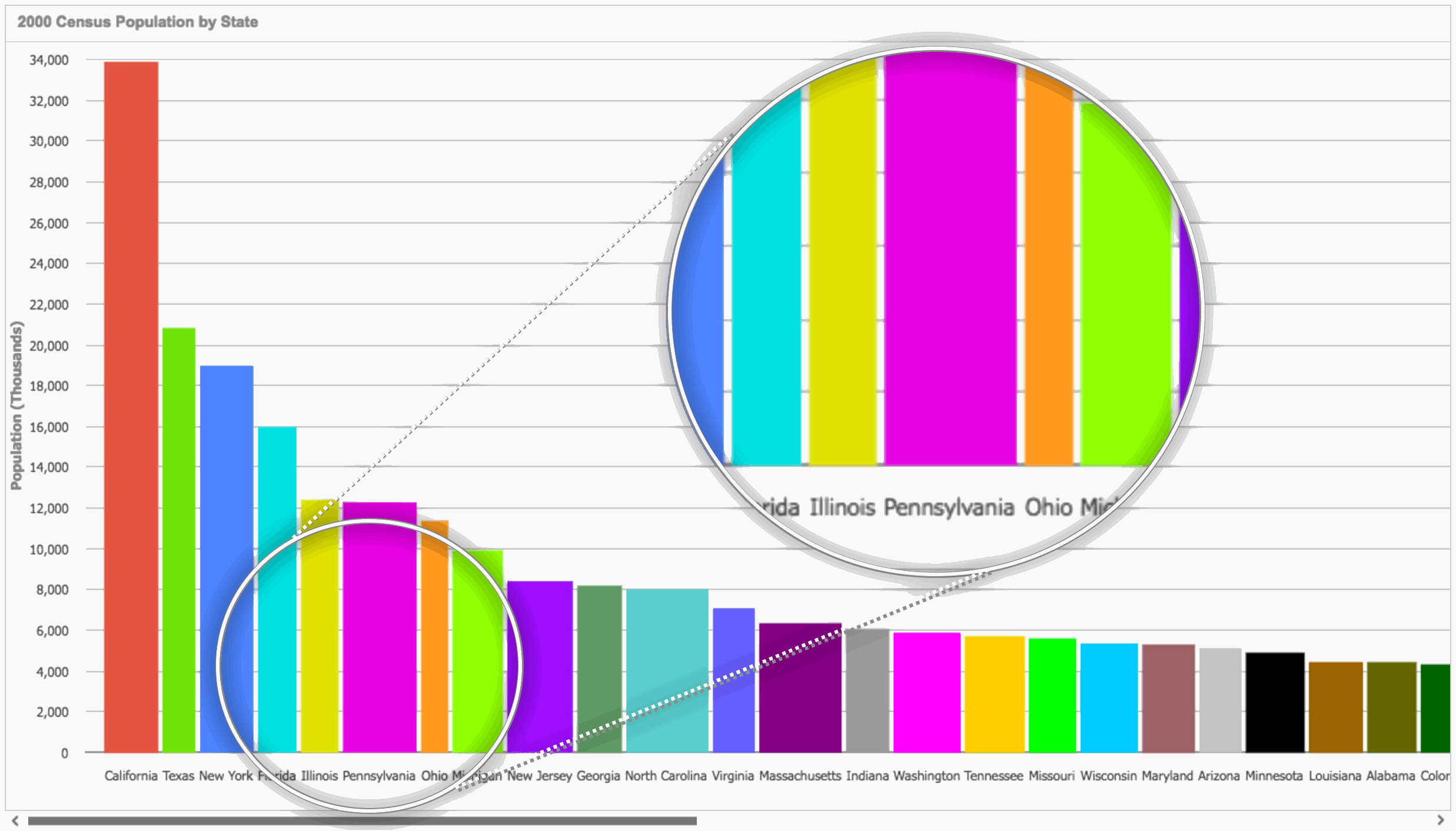
Sometimes when you try to fit it all on one page, it just becomes unreadable. Labels have to be rotated by 90 degrees because they otherwise won’t fit, and the chart is so squashed up, it is hard to tell one bar from another. Kinda like this …
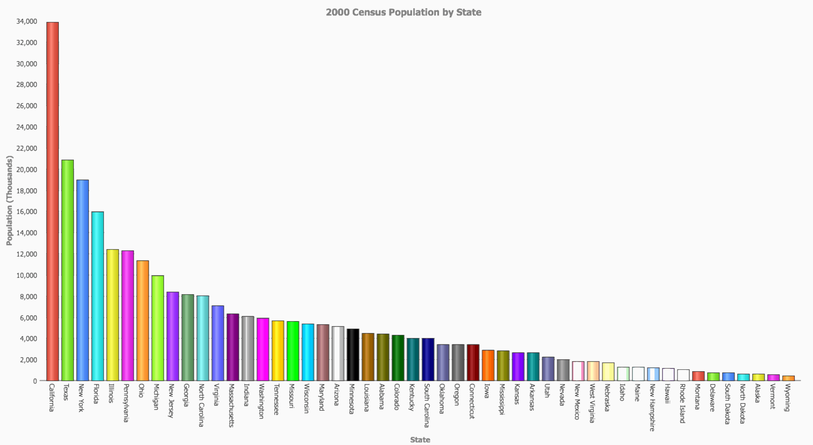
So in 11.1 | 6.1, we are providing more options …
Automatically Expand and Scroll to Show Content
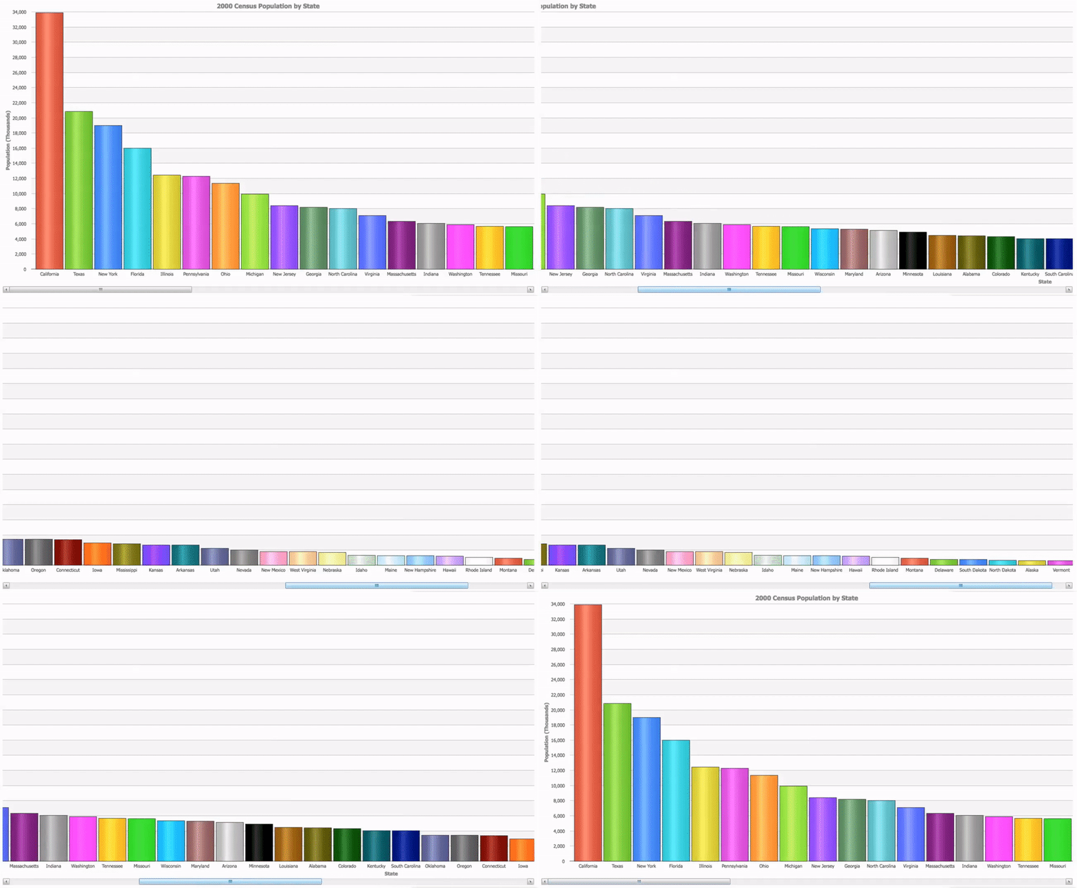
As you can see, the chart below automatically expands horizontally to show content. This is enabled by the autoScrollData property. Automatic expansion can be driven either to fit per-facet-value bar thicknesses specified by defining a getMinClusterSize method for the chart, or by the requirement that all labels fit on the horizontal axis without overlapping
1. Bars All the Same Width
Here, all of the labels fit horizontally, and all the bars are the same size. Scroll horizontally to see more data.
2. Dynamic Bar Thickness
Instead of having all the bars the same width, let the width of each be driven by the length of the corresponding label. This means the labels will be readable, without taking up more horizontal space than is necessary – so less horizontal scrolling. Yay! 🙂 Check it out …
Dashboard & Tools: Ctrl-C / Ctrl-V
The upcoming release will have built-in copy and paste with keyboard shortcut support, automatically enabled wherever selection is turned on.

View documentation and related APIs here >
Visual Builder DataSource Validators
With 11.1 | 6.1, powerful functionality is introduced to allow validators to be quickly and easily added to datasource fields in Visual Builder. This feature has a great degree of flexibility, allowing you to specify what type of validator will be applied and under what conditions … and even the error messages that will be displayed. See the simple steps below to set one up.
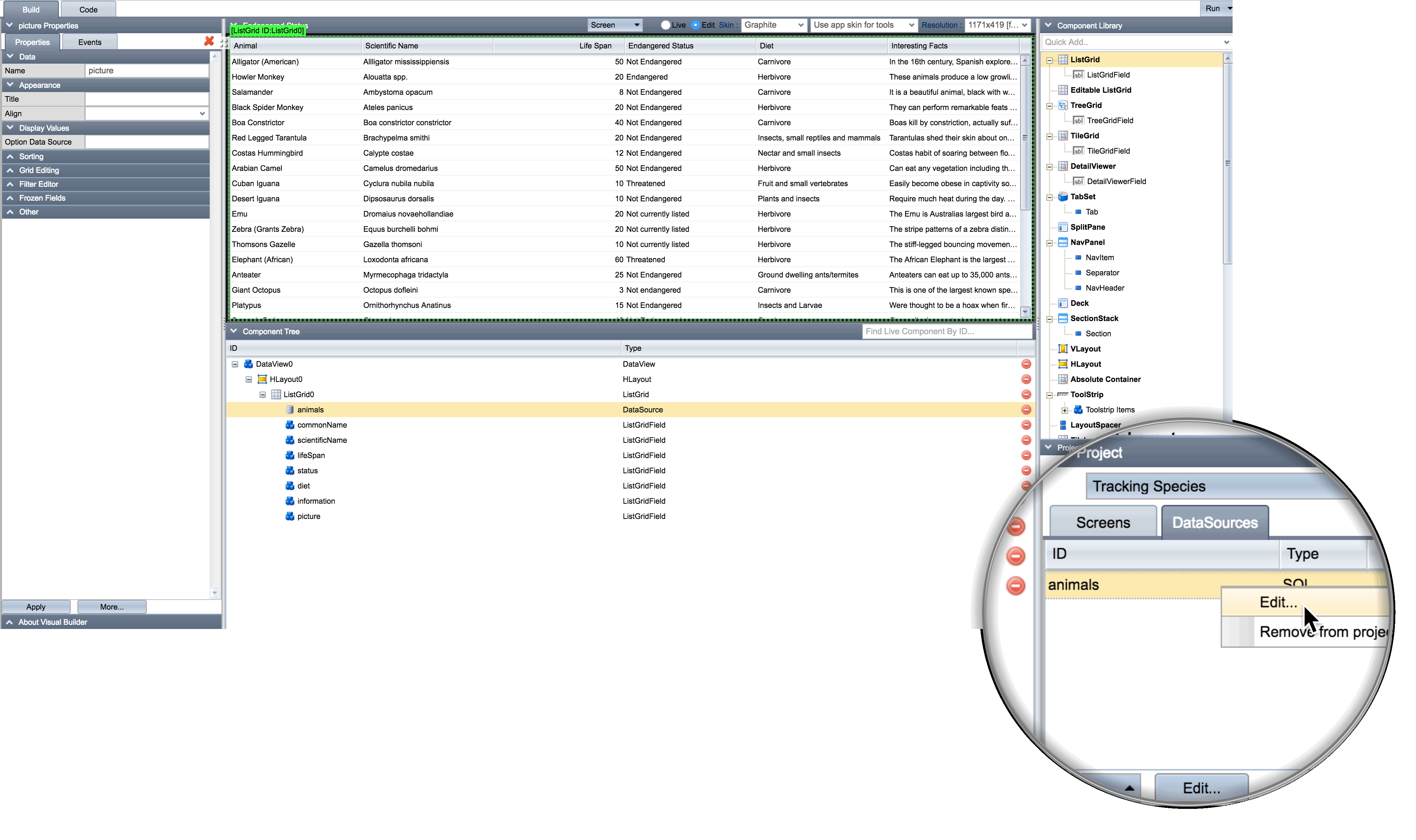
1. From within Visual Builder, choose to edit a datasource
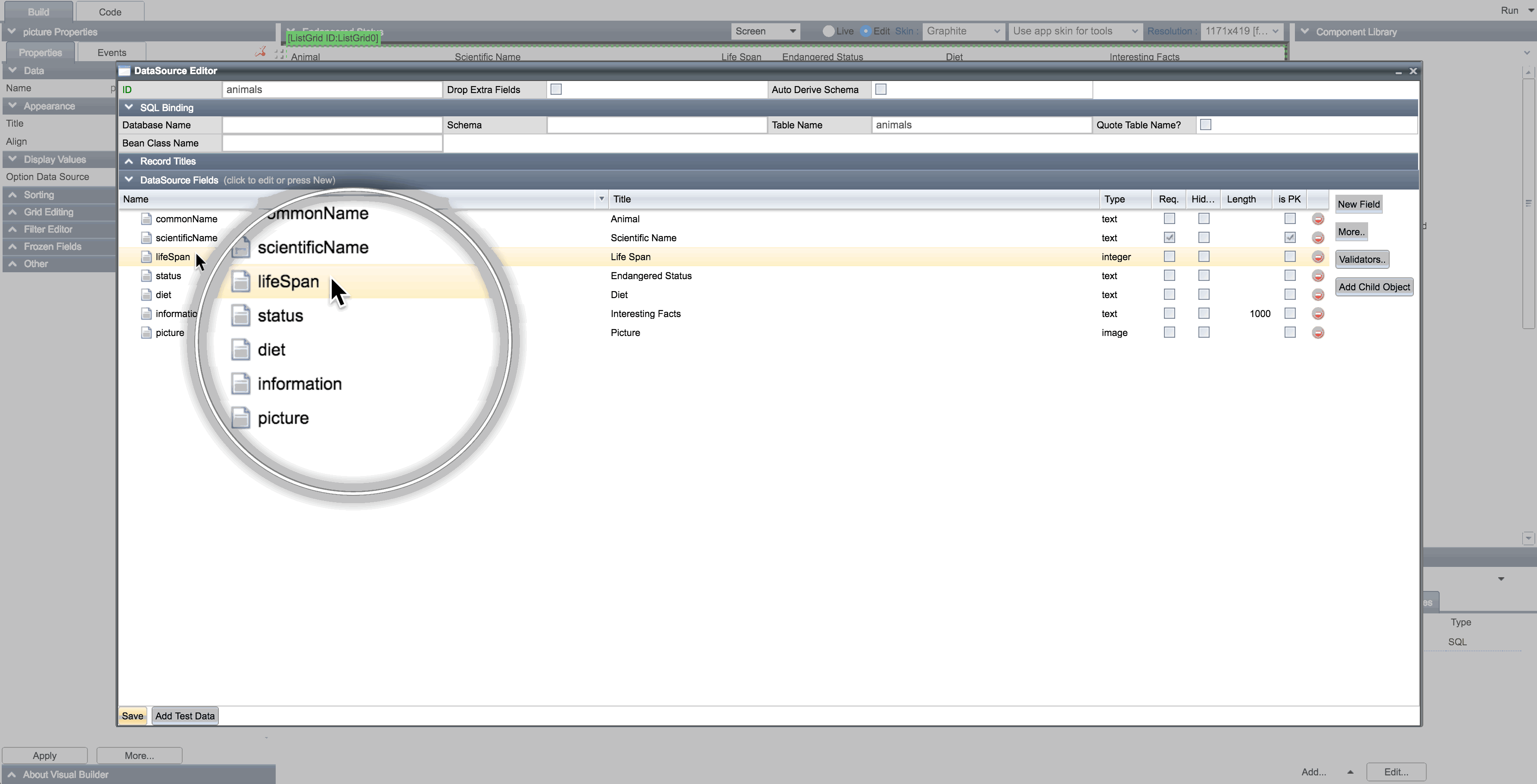
2. Select the desired field:
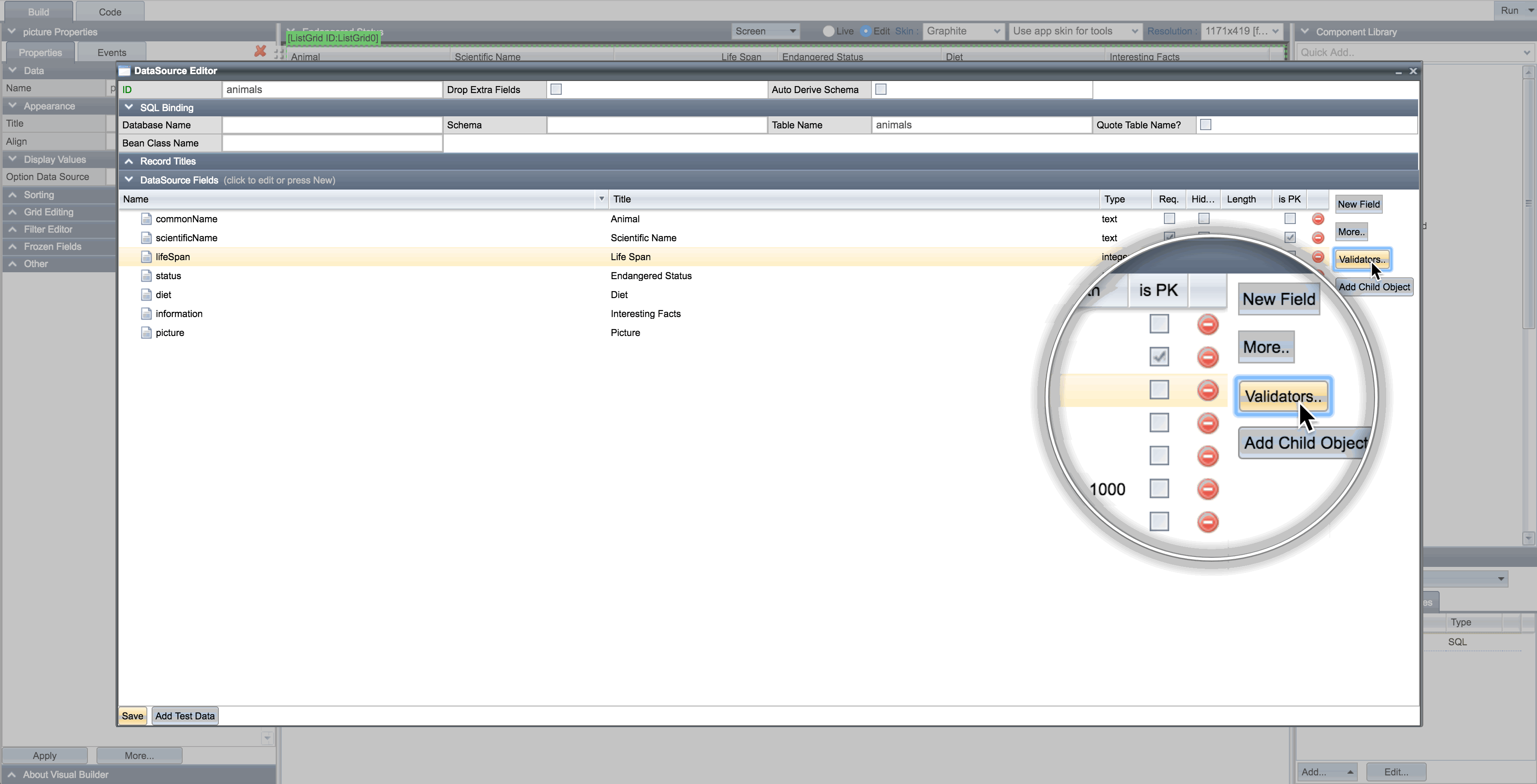
3. Click the new Validators button
4. Select the desired validator type from the list
Choose from: ‘has related record’, ‘integer range’, ‘is one of’, ‘is unique’, ‘matches field’
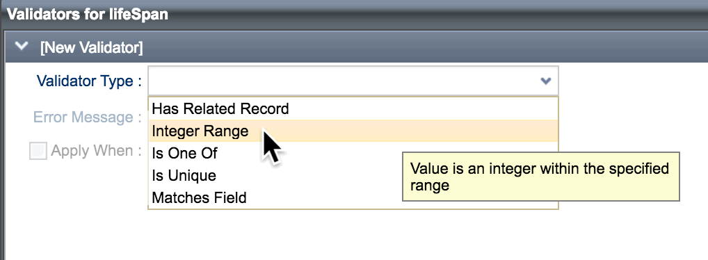
… then enter the required values, including an appropriate error message.
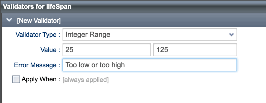
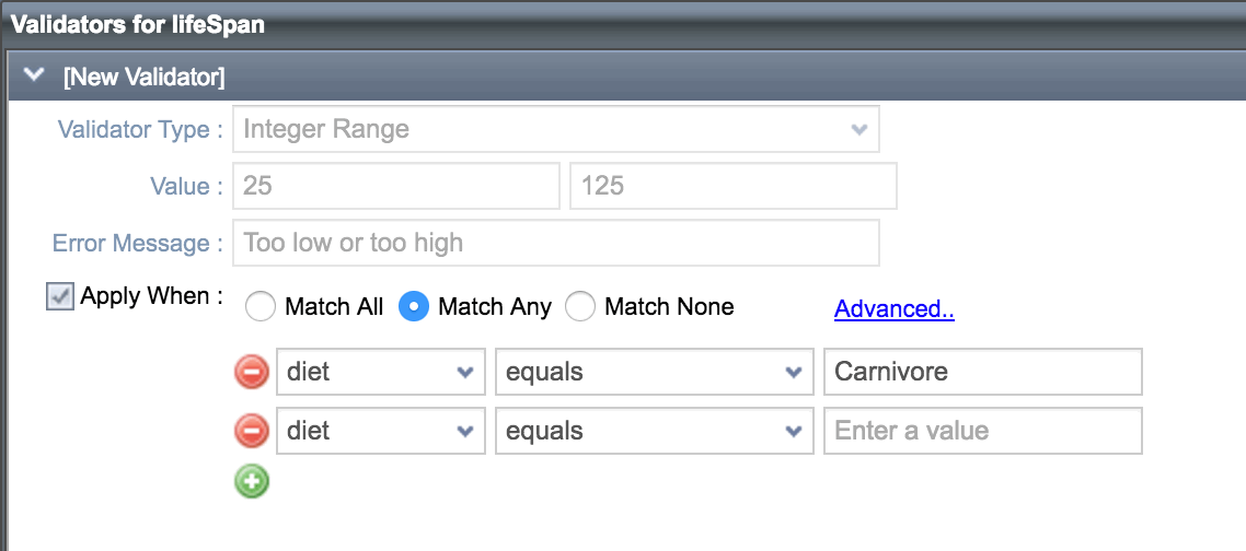
5a. Specify when the validator should be applied:
Choose Always, or only under specific conditions:
5b. For more complex scenarios, use the Advanced option which allows nested conditions:
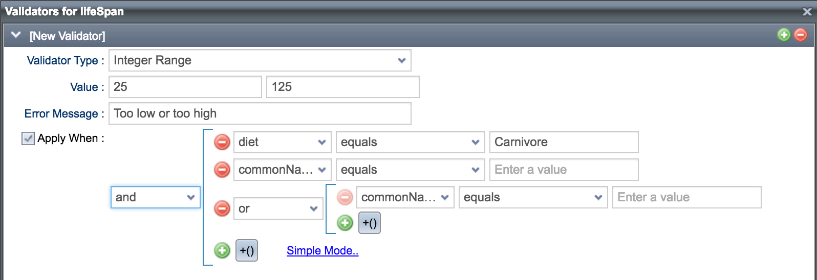
As you can see, very easy to use, but very powerful.
Thanks for reading out blog! Watch this space for more 11.1 | 6.1 features.
*** Remember: Upgrades to 11.1 | 6.1 are FREE to those who have already purchased 11.0 | 6.0. ***
For those not yet on 11.0 | 6.0, upgrade discounts are available and are based on the date of your last license purchase. View our License FAQs for more details. If you would like to upgrade, please contact us.
Best,
The Isomorphic Team!

