Mobile Features Optimize UX and Dev Effort
The Isomorphic Enterprise Mobile Application Strategy
Many analysts, MEAP providers and other “experts” promote a mobile enterprise application platform strategy that was developed for consumer offerings (LinkedIn, Facebook, Twitter, etc.). At Isomorphic Software, we realize that Enterprise users and Consumer users have very different needs and usage patterns. So our strategy is different:
- Built in mobile adaption that allows you to code once for all devices
- Intelligent Data Management for unprecedented scalability and responsiveness
- The broadest, deepest set of device aware Enterprise grade UI components
Responsive Layout
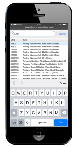
Trying to cram a complex UI with multiple panes onto a handset screen creates a usability disaster. Isomorphic has a better solution. When multiple panes don’t fit side-by-side on a device, we automatically split them across pages. Appropriate navigation controls are provided for each specific device class, and extremely smooth transitions deliver an enterprise grade experience.
Intelligent Auto-fitting
To make best use of limited screen space, our components feature pervasive auto-fitting capabilities. This goes beyond “responsive design” – using CSS tricks to adjust page layout by browser size – because it works for dynamic data and localized strings, whose size can’t be anticipated in advance. The NavigationBar component is an excellent example, subtly adjusting navigation controls to maximize the space allocated to the current view’s title.

Remote Debugging
Users quickly ditch mobile applications that are not robust. Regaining trust is at best an uphill battle. You therefore need to get it right the first time.
Remote Debugging allows you to run the Developer Console on your desktop machine to debug a page running on a mobile device. With Remote Debugging, you can use all of the powerful debugging features of the Developer Console – the component hierarchy (Watch tab), client/server requests (RPC tab), logs and log categories – using the large screen and physical keyboard of a desktop machine.
Adaptive UI
Our components automatically adapt to the smaller screen size and different pointing behavior of mobile devices. Components like Combo Boxes, Menus and Dialogs will automatically use the entire screen and offer alternative UI for dismissal and navigation (for example: submenus slide in). Context menus and hovers can be triggered by finger taps or long touches.
Because of these and many other automatic behavior changes for mobile devices, you really can build cross-device applications with a single technology and single codebase
SpinnerItem for Touch Devices
On touch devices, the SpinnerItem change appearance and behavior to make it easier for users to hit the increment and decrement buttons.

Mobile Device Mode for Window & Dialogue Components Â
To create a more seemless experience, window and dialogue components have a special mode for mobile devices.
In the special mode, these components fill the screen and have a simplified appearance, adsent of shadows and rounding (skin specific).Â

Calendar UI
With the desktop calendar, tabs provide the ability to toggle between day and weeks. However, in mobile, the compact calendar does not have tabs.
As such, the compact calendar now allows users to switch between day/week views on mobile device pivot.
Enjoy!
The Isomorphic Team

