A Better User Experience (and a Sneak Peek at the Next Release)
 Our next release  (SmartClient 10.1 / Smart GWT 5.1) is still a little way off, but we would like to share some details. We also want to give you the opportunity to play with some of the BETA (pre-release) features. This blog will focus on user experience. However, there will be more blogs about other aspects of the 10.1 /5.1 content, so please look out for them.
 *** One important point … upgrades to 10.1 and 5.1 are FREE to those who have already purchased 10.0 / 5.0. ***
So, without further adieu, let’s talk about user experience …
Building an application that users love needs a great understanding of the business requirements / problems you are trying to solve; translating these into a functional design … then of course developing, testing, releasing and maintaining the application. This all takes a long time and there is often little time left to focus on making the user experience as good as it needs to be. In addition, some things that seem small and insignificant require big workarounds / hacks that outweigh the perceived benefits.
The problem with this is things that seem independently insignificant can collectively make the end user’s life miserable. The end result being that they don’t want to use your application. At Isomorphic, we are therefore trying to make it easier and faster for you to go the extra mile from a user experience perspective.
Below are a few BETA features that you can start playing with right now.
Visual Changed State
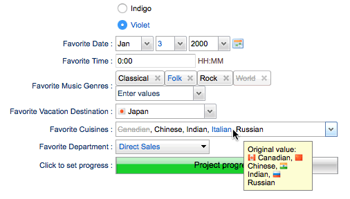
In SmartClient 10.1 / Smart GWT 5.1, FormItems will support a pending visual state that can be used to style the item differently when the user changes the value from the last-saved value. This includes showing strikethrough appearance for values in multiple-select controls. Try the live sample now!
Inline Icons
It’s now easy to place icons inside of editable text fields such as ComboBoxItems, for decoration or to provide functionality when clicked. Icons support left or right alignment, and multiple icons are allowed on each side. Try the live sample now!
Nav Bar Animations
Our NavigationBar component has been given subtle, built in animations / transitions that not only look cool, but help users keep their sense of place. Notice how the clicked button glides in to be the new heading, while the new buttons fade in to place.
Spriting
A CheckboxItem’s checkbox can be sprited by setting a custom boolean Base Style and writing the CSS to apply the appropriate background-position for the checkbox’ current state. Try the live sample now!
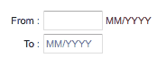
Hints, Tips and Format Masks Improved Placeholder Behavior
When filling out a form, it helps to guide the user as to what data and format is expected. The behavior has been improved such that hint / tips persist even when the user places their cursor in the field. The hints / tips only disappear once the user starts typing. See the example below and try the live sample now.
The above are just some quick insights into a couple of the user experience enhancements we are providing in 10.1 / 5.1. There’s a lot more to come besides this, so check back here for more updates.
As always, thank you from all the Isomorphic Team!
P.S. Thanks for reading our blog. If you would like us to cover any specific topics or have any feedback, please let us know by emailing jason@isomorphic.com.

